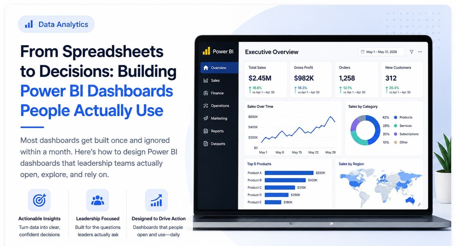
Power BI is Microsoft's business intelligence tool for turning analyzed data into interactive dashboards and reports — and for a data analyst specifically, it's the final, essential step that turns analysis into something a decision-maker actually opens, understands, and uses, rather than a spreadsheet or script result nobody but the analyst ever looks at.
The Core Skills That Matter for Analysts
- Power Query — connecting to and cleaning data sources before they ever reach a visual, functionally similar to what Excel's Power Query and Python's pandas both do, just inside Power BI's own interface.
- Data modeling — structuring tables with proper relationships (a star schema, in BI terms) rather than one flat table; this single decision has more impact on dashboard performance and correctness than any individual visual choice.
- DAX basics — Power BI's formula language, needed for calculated measures like year-over-year growth or a running total; you don't need to master every DAX function, but the common patterns (CALCULATE, SUMX, time-intelligence functions) come up constantly.
- Visual design for clarity — choosing the right chart type for the actual question, consistent color use, and cutting anything that doesn't map to a real decision someone needs to make.
The Most Common Beginner Mistake
Building a report with fifteen charts because the data allows it, rather than three or four charts that answer the specific questions the audience actually has. A dashboard's job is to answer "what do I do next" quickly — more charts almost always mean more time spent finding the one that matters, not more insight delivered.
How Power BI Connects to the Rest of the Analyst Toolkit
Power BI is rarely the starting point of an analysis — it's usually the last step, after data has already been pulled with SQL or cleaned with Python/Excel. Learning it in isolation, disconnected from where the data actually comes from, is a common reason beginners build dashboards that look fine in a portfolio but wouldn't survive contact with a messy real data source.
A Realistic Practice Project
Take a multi-table sales or operations dataset, connect it in Power BI via Power Query, build a proper data model with relationships (not one flat table), and design a 3-4-page report answering specific questions — one page for a monthly summary, one for regional performance, one for a specific KPI leadership tracks weekly. This mirrors the kind of dashboard work in our Data Analytics Projects guide, and it's the same structure used for the capstone project in our online Data Analytics course, which teaches Power BI as the natural final step after SQL, Excel, and Python — not as a standalone tool.