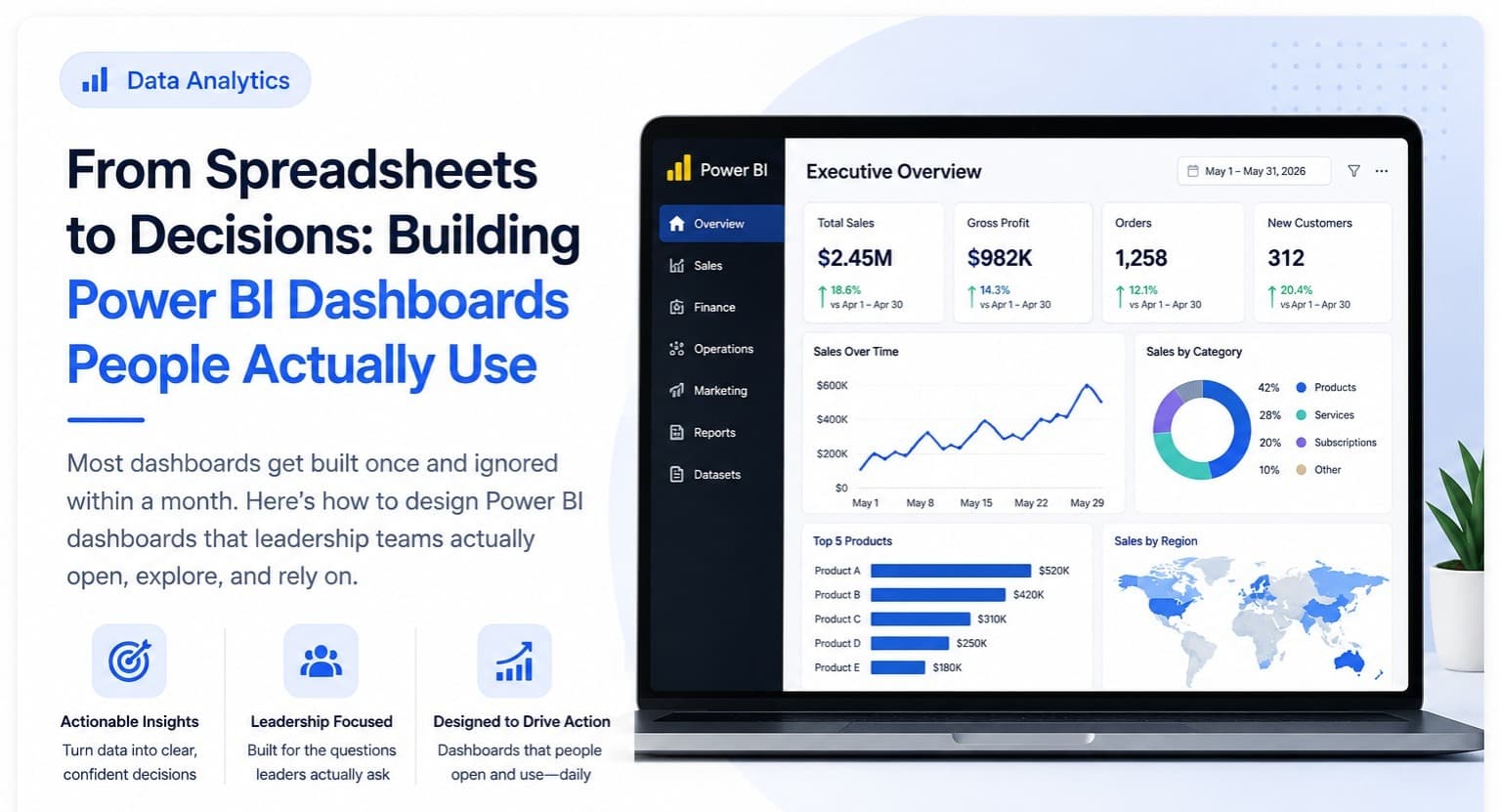
We've been building dashboards for long enough to notice a pattern that has nothing to do with which BI tool a client chooses and everything to do with how the dashboard was scoped in the first place: the ones that get abandoned within a month were almost always built around "here's the data we have," and the ones that survive years of daily use were built around "here's the exact decision this person makes every week." That distinction, more than any visual design choice or technical feature, is the actual difference between a dashboard people open and one they quietly stop trusting.
The failure mode is specific and repeatable. A dashboard launches with genuine enthusiasm — fifteen charts, every metric anyone asked for, a polished design. Within two weeks, the person it was built for has stopped opening it daily, because finding the one number they actually need each morning requires scanning past fourteen charts that answer questions they don't actually have. They quietly go back to whatever manual process — a personal spreadsheet, a gut-feel check-in with a colleague — got them the answer directly before the dashboard existed. Nobody complains about the dashboard; it just stops being part of anyone's actual routine, and the investment in building it never pays back.
Building one that survives starts with a conversation most dashboard projects skip: sitting down with the actual person who'll use it and asking, specifically, "what decision do you make with this information, and how often." Not what data would be interesting to see — what decision gets made, and what action follows from it. A regional sales manager's real question most mornings is "which of my accounts need attention today," not "show me every metric sliced fifteen ways." If a chart doesn't map directly to a decision or the action that follows it, it doesn't belong on that person's dashboard, regardless of how interesting the underlying data is to someone else in the business.
The technical foundation matters more than most non-technical stakeholders assume, specifically around speed. A dashboard that takes even five or six seconds to load trains its users, within days, to stop trusting or bothering with it — slow tools get quietly abandoned regardless of how accurate their numbers are. This means the unglamorous work of getting the data model right before building a single visual: proper fact and dimension tables rather than one sprawling flat file, transformations handled upstream rather than recalculated live every time someone opens the report, and genuinely fast underlying queries. Nobody notices this work in a demo. Everybody notices its absence within the first month of real use.
The last piece, and the one businesses most consistently skip, is ownership. Every dashboard we've seen survive past its first year has one specific person responsible for reviewing it monthly, confirming the underlying data connections still work, and adjusting it as the business's actual questions evolve — because they always do. A dashboard with no named owner slowly drifts out of sync with reality as source systems change, and nobody notices until someone makes a bad decision off a number that quietly stopped being accurate months earlier. Map the real decision, build the data model to support fast answers, and assign a real owner — that combination is what separates a dashboard that becomes part of how decisions actually get made from an expensive one-time demo nobody opens again.