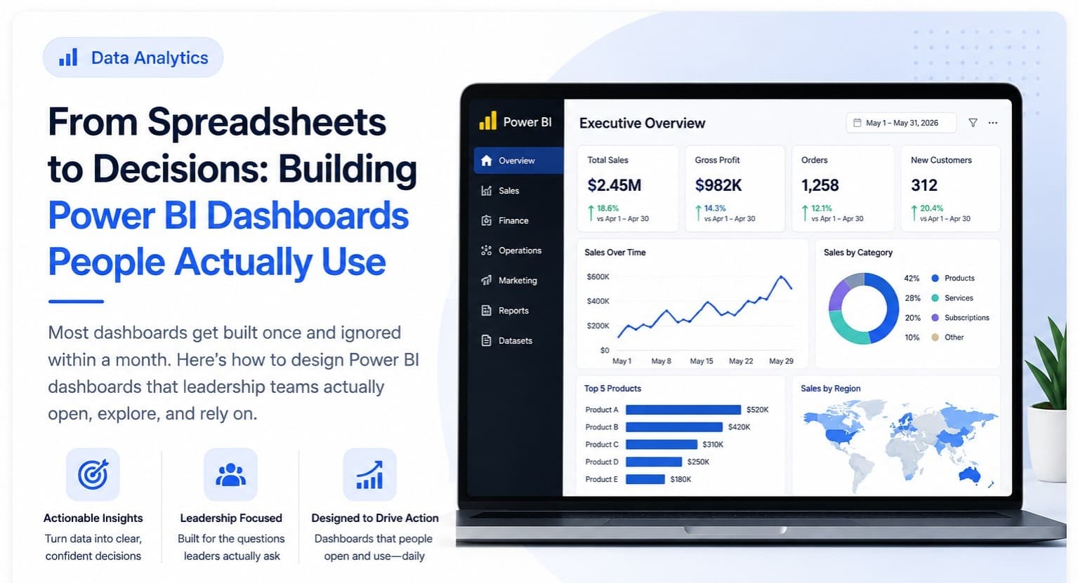
We've built dashboards for dozens of clients, and the failure pattern is remarkably consistent: a beautiful dashboard gets delivered, everyone is impressed in the launch meeting, and within a month nobody is opening it anymore. The dashboard isn't wrong, exactly — it's just not answering the question anyone actually has when they open it. Understanding why this happens, and how to avoid it, matters more than any particular Power BI feature or visual style.
The root cause is almost always that the dashboard was built around what data was available rather than around the specific decisions it needs to support. A sales dashboard with fifteen charts covering revenue by region, by product, by rep, by month, and by channel looks comprehensive, but a regional manager opening it on a Monday morning has one real question: "which of my accounts need attention this week." If the dashboard doesn't answer that question in the first five seconds, the manager will go back to whatever spreadsheet or gut-feel process they used before, because that process, however manual, at least gets them to an answer directly.
The fix starts before you open Power BI at all — it starts with interviewing the actual people who'll use the dashboard and asking them what decision they make weekly, and what information they currently gather (often manually) to make it. We build what we call a "decision map" for each dashboard: for every screen or page, we write down the specific decision it needs to support and the specific action someone will take based on what they see. If a chart doesn't map to a decision or an action, it gets cut, no matter how interesting the underlying data is. This single discipline eliminates most of the clutter that makes dashboards unusable.
On the technical side, performance is not a nice-to-have — it's the difference between a dashboard that gets opened daily and one that gets abandoned after the first slow load. This means getting the data model right before building visuals: using a proper star schema with fact and dimension tables rather than one giant flat table, pushing transformations upstream into Power Query or the source database rather than relying on slow calculated columns, and being deliberate about which measures use DAX versus which can be pre-aggregated. A dashboard that takes eight seconds to load trains its users to stop trusting it, even if the numbers are accurate.
Visual design matters more than most technical teams give it credit for, but not in the way people assume — it's not about making charts prettier, it's about reducing the cognitive load required to extract the answer. This means consistent color encoding across every page (revenue is always the same color, targets always another), avoiding pie charts and 3D effects that distort comparison, using conditional formatting to draw the eye directly to what needs attention (red for accounts below target, for instance) rather than making the viewer scan every row themselves, and defaulting to the most useful time range rather than making users click through filters every time they open it.
The last, and most overlooked, ingredient is a maintenance owner. Every dashboard we've seen survive past six months has one named person responsible for reviewing it monthly, checking that the underlying data connections are still healthy, and updating it as the business's actual questions evolve — because they will evolve. A dashboard without an owner quietly rots as source systems change and nobody notices the numbers have drifted. Get the decision map right, get the data model right, design for five-second comprehension, and assign a real owner — that combination, far more than any single Power BI feature, is what turns a one-time impressive demo into a dashboard leadership actually opens every single week.